Branding & Logo Design: SLS Needlepoint
When my good friend Samantha from SLS Needlepoint reached out about helping her with her rebrand, I couldn't have been more excited or honored!
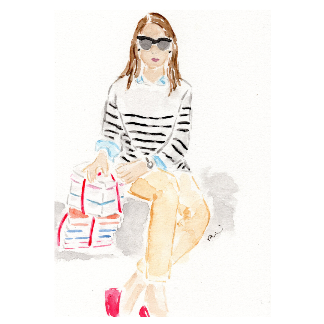
I created a few custom illustrations for Samantha over the past year, and in doing so had gotten to know her brand and aesthetic. Her designs are classic with a twist, so I wanted to make sure that her new logo represented that.
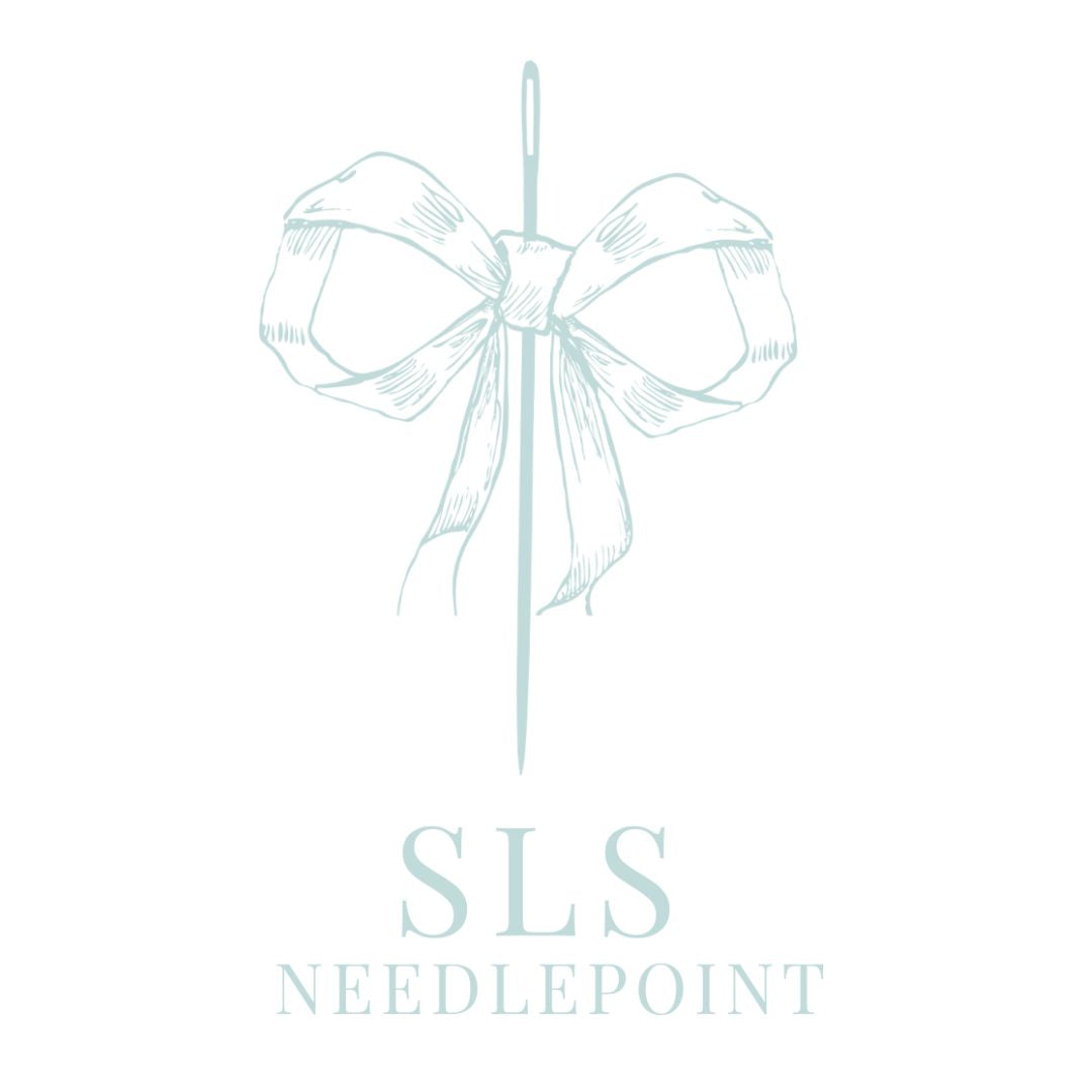
Here's what I came up with!

When looking at Samantha's collection of hand-painted needlepoint canvases, they are all fun & ultra feminine. Needlepoint for the grandmillennial, if you will! I thought the best way to represent those values was via a needle and bow. Timeless elements, but in a modern form.
And I mean...who doesn't love a bow?

I created two contrasting color schemes, so that the inverse could be used a secondary logo.
For the lettering, I chose a classic font that is used by many fashion publications. It is simple, yet elegant, which nods to the timelessness of needlepoint.

I am so excited to see what SLS Needlepoint creates in the future! Want to look at Samantha's new website? Click here to see her work!


Leave a comment
This site is protected by hCaptcha and the hCaptcha Privacy Policy and Terms of Service apply.